
User Experience (UX/UI)

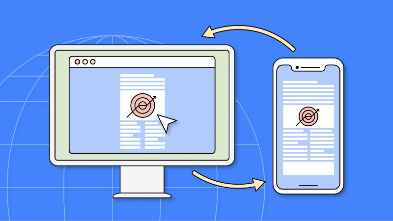
Responsive Design: Not Just a Matter of Screen Size

Responsive design is about performance, accessibility, context, and usability, not just screen dimensions.

Ahmed Oumezzine Ahmed Oumezzine 6 min read
  • Table of contents unavailable
Responsive Design: Not Just a Matter of Screen Size

Introduction

“My website adapts to screens… but does it adapt to real life?” You have probably already heard this phrase:

“Your website needs to be responsive.”

But honestly… what does that really mean?

Does it simply mean your website shrinks when you move from desktop to smartphone?

Is simple resizing enough?

No. And what if I told you that real responsive design is not really about screen size… but about empathy?

Why Responsive Design Has Become Essential

A large share of web traffic now comes from mobile devices.

In other words, many of your visitors are viewing your website from a phone — often while walking, on public transport, outside in bright sunlight, or with an unreliable connection.

Imagine this:

“I’m looking for a restaurant, I’m in a hurry, it’s raining, my finger slips on a button that is too small… and BAM! The website breaks.”

That has probably happened to you before, right?

And that is exactly where responsive design can fail its mission.

Because responsive design is not just about adapting to screen size.

It is about adapting to people’s real lives.

The 3 Pillars of Responsive Design — According to Ethan Marcotte

In 2010, Ethan Marcotte helped redefine modern web design with a simple idea:

“Instead of building ten different websites, let’s build one… that adapts.”

He described responsive design around three core ideas:

  1. Flexible grids → Like a puzzle that reorganizes itself depending on the size of its container.
  2. Fluid images → Images that stay within their containers and adapt to available space.
  3. Media queries → CSS instructions that say: “If the screen is smaller, change the layout.”

You can learn these techniques on your own for free through resources such as MDN, freeCodeCamp, or OpenClassrooms.

And they are among the first steps toward becoming a web developer.

But remember: the technical side is only the beginning.

Responsive Design Is Much More Than a Game of Pixels

You can have a perfectly “responsive” website… that is still almost impossible to use.

Because the real challenge is not just technical.

It is about user experience.

What If We Thought About Context, Not Just Screens?

Ask yourself these questions:

  • Is the user moving? Then simplify the experience.
  • Are they three meters away from a TV screen? Then make text easier to read from a distance.
  • Are they using a screen reader? Then make everything clear, structured, and accessible.
  • Do they have a poor internet connection? Then compress, simplify, and prioritize.
“But I can’t predict everything!”

No. But you can start with what matters most.

4 Concrete Examples: What Works — and What Does Not

❌ Example 1: The “Shrunken” Website

You zoom, pinch, and scroll… but the buttons are packed together and the text is unreadable.

That is not responsive design. That is lazy design.

✅ Example 2: The “Rethought” Website

On mobile: the menu becomes a hamburger menu, images adapt, and the “Book” button is large and easy to reach.

Now you can feel that someone actually thought about the user.

What About Major Platforms? How Do They Handle It?

  • Airbnb: On mobile, the booking flow is simplified. On desktop, you can explore more details. → Adapted to the usage context.
  • Spotify: Touch interactions are designed for fingers rather than a mouse. → Interaction comes before appearance.
  • NASA: Even scientific websites need responsive experiences. Interactive content and visualizations still need to work across different devices.
  • Dropbox: On mobile, quick actions are prioritized. On desktop, file and folder management becomes more detailed. → The design follows the task, not just the screen.

Responsive Design = User-Centered Design

The key word? Empathy.

“What does this person need right now?”

Here are three questions to ask before you start coding:

  1. Where is the user? → On a train? On the couch? In a supermarket?
  2. What do they need to do? → Read? Buy? Scan? Share?
  3. What constraints do they have? → Poor vision? Cold hands? Slow mobile connection?

Test on real devices, not only in Chrome’s mobile emulation mode.

Because a website that works perfectly on your laptop… may be frustrating or unusable on an older phone.

The Future of Responsive Design: Intelligent, Contextual, Human

Responsive design no longer stops at screen size.

It is becoming smarter and more contextual.

Trends Worth Knowing:

  • Mobile-first: Start with the smallest experience and enhance from there.
  • → If the essential experience does not work well on mobile, something is wrong.
  • Progressive Enhancement:
  • → Build a solid baseline for everyone, then enhance it for more capable devices.
  • → Like a cake: start with the base, then add the icing.
  • Container Queries:
  • → Components adapt to their container rather than only to the viewport.
  • → More flexibility, especially for reusable components.
  • Dark Mode & System Preferences:
  • → Respect the user’s settings. It is simple and user-friendly.
  • PWA — Progressive Web Apps:
  • → Websites that can behave more like applications.
  • → They can support features such as installation and offline capabilities when implemented properly.
  • → A great area for learning: build, experiment, deploy.

5 Practical Human-to-Human Tips

  1. Start with mobile
  2. → Imagine your website on a 360px-wide screen. What is truly important?
  3. Use fluid units
  4. → Prefer units such as rem, em, fr, and % when appropriate instead of relying only on px.
  5. → This can make layouts and typography more adaptable.
  6. Test with your thumb
  7. → Buttons and interactive targets should be large enough to tap comfortably.
  8. → Give touch targets enough space to avoid accidental taps.
  9. Optimize images
  10. → Use modern formats such as WebP, compress your images, and use srcset when appropriate.
  11. → A slow website quickly becomes a frustrating website.
  12. Think about the “usage context”
  13. → Create user stories: “Marie, 35, is looking for a doctor at 8 p.m. while walking and using her phone.”

In Summary: Rethink, Don’t Just Shrink

Responsive design is not just a technique. It is a philosophy.

It should be:

  • Inclusive → designed for different users, abilities, devices, and contexts.
  • Efficient → fast, smooth, and functional.
  • Human → centered on the person, not the pixel.

And the good news is that you can learn all of this independently, step by step, for free.

You do not need to be an expert to start becoming a web developer.

You need curiosity, practice, and empathy.

Conclusion: What If We Rethought the Web… Together?

“Good design is often the design you barely notice.”

The web is no longer tied to a single place or device.

It is a living ecosystem made of contexts, situations, and real lives.

So yes:

  • 👉 Adapt your grid.
  • 👉 Use media queries.
  • 👉 Optimize your images.

But most importantly…

  • 👉 Put yourself in the user’s shoes.

Because real responsive design

is not only about adapting to the screen…

it is about adapting to the person behind the screen.

And what will you start with today?

Maybe testing your website on a real phone?

Or redesigning a button to make it more accessible?

👉 Every small step matters.

And every step helps you become a better web developer with a real impact.

Share in X